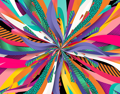
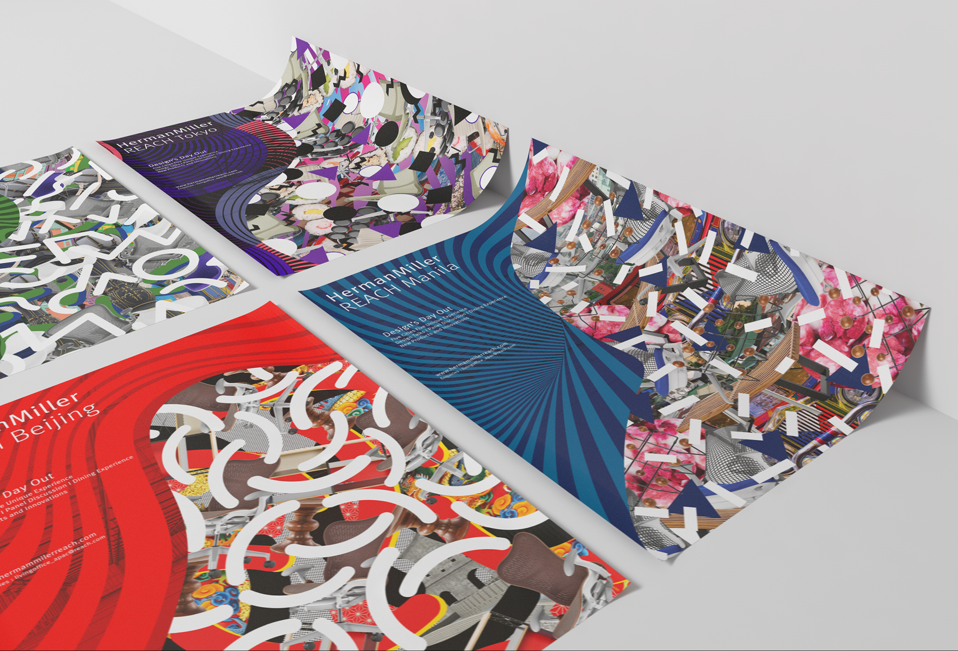
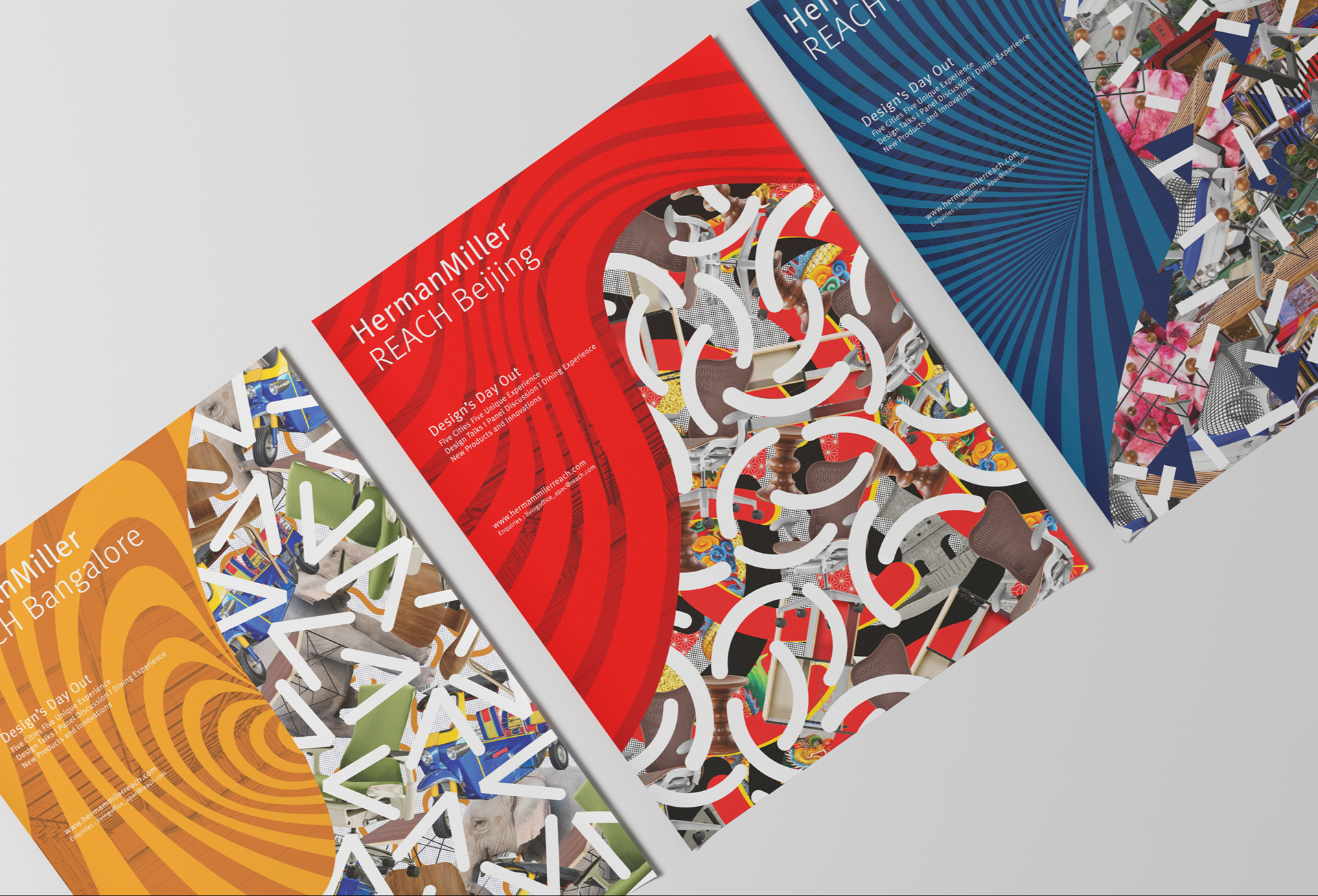
Herman Miller asked me to make the new graphic identity of their design festival in Asia, we did 5 illustrations for each city

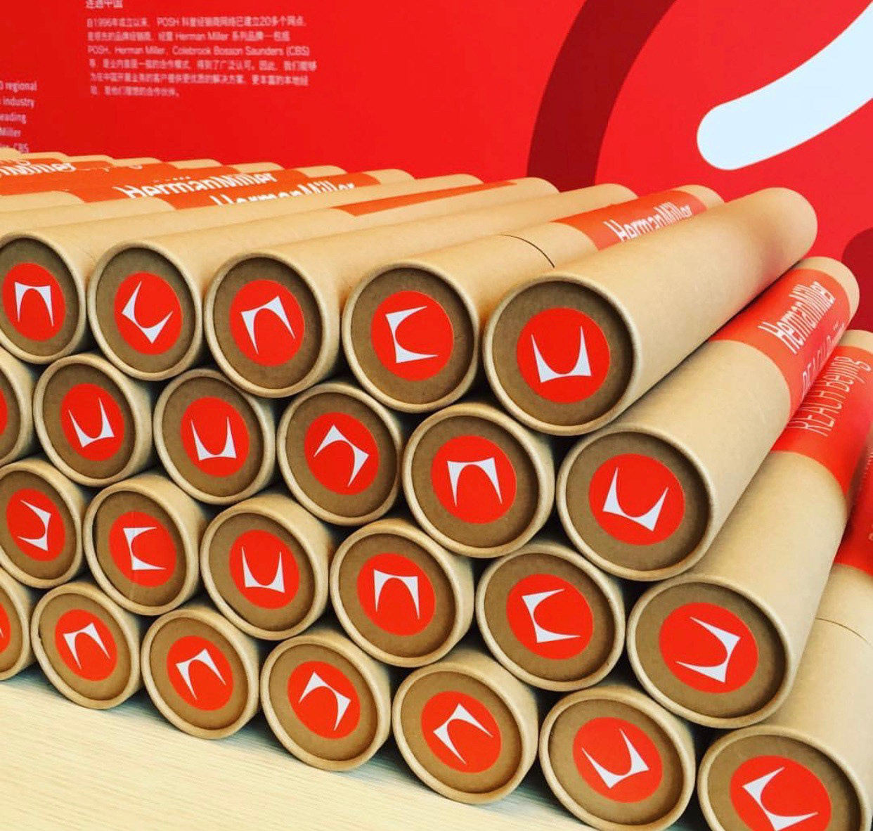
reach.com is designed to connect to the design community as well as our customers in Asia Pacific. The four primary sections – Business, Lifestyle, Projects, and Events – together create a macro outlook of the region’s trends. reach.com includes coverage on local initiatives around Herman Miller, POSH and CBS (Colebrook Saunders).

I started with a mind mapping to organize my ideas and references with the client

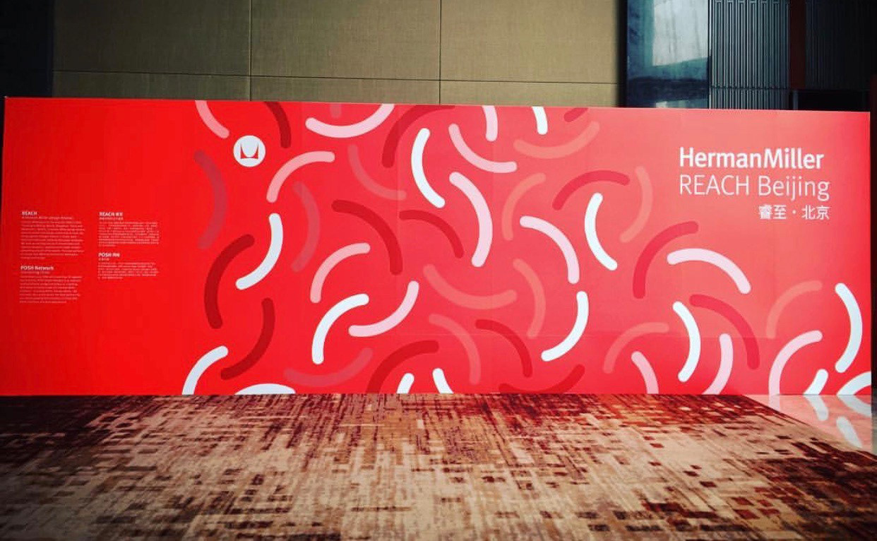
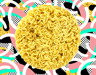
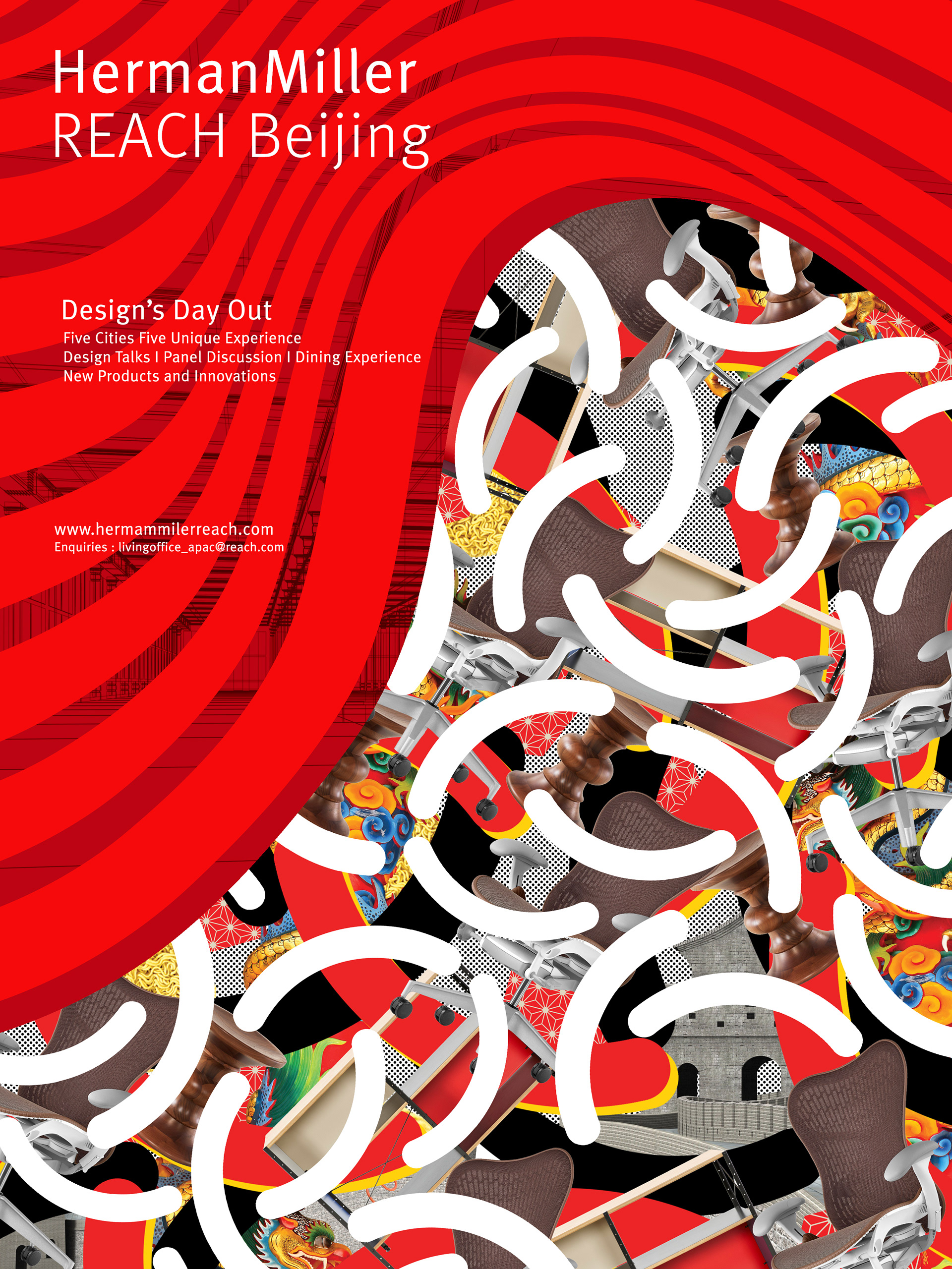
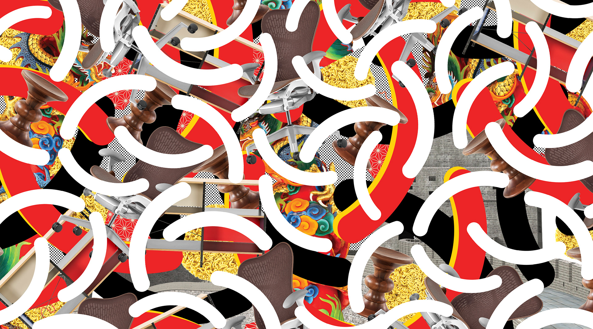
BEIJING, CHINA
For this city we tried to express the colors themes of the country, the food, a dragon, a oriental pattern and the Great Wall


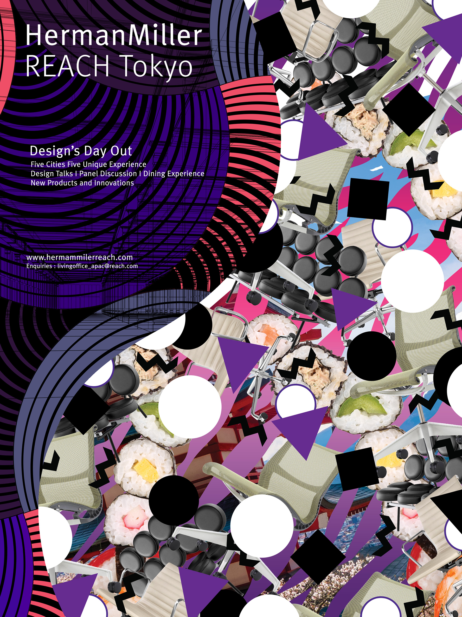
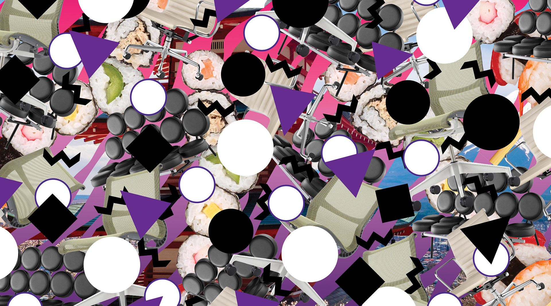
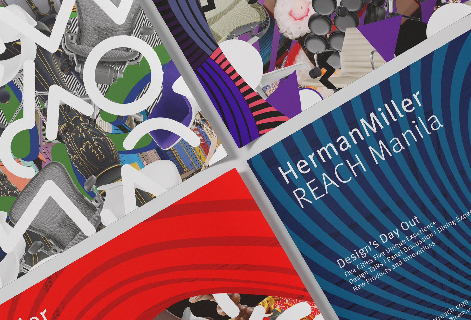
TOKYO, JAPAN
This illustrations represents the small streets, the neon lights and sushi


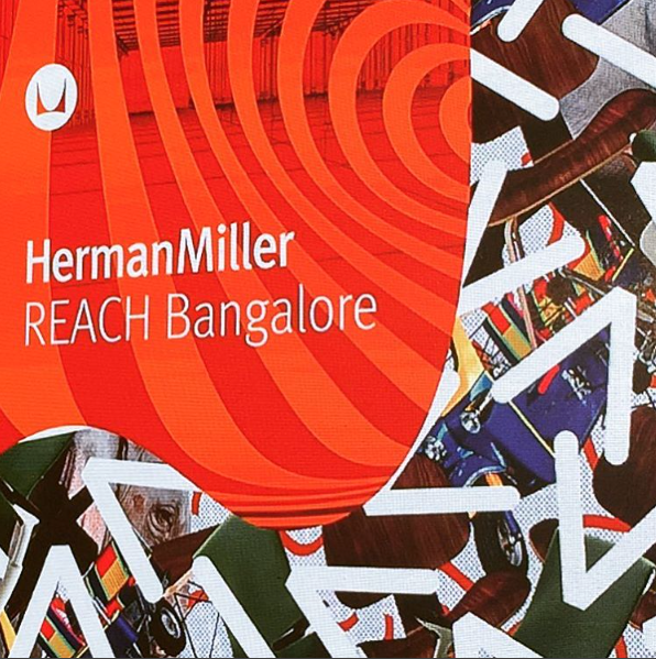
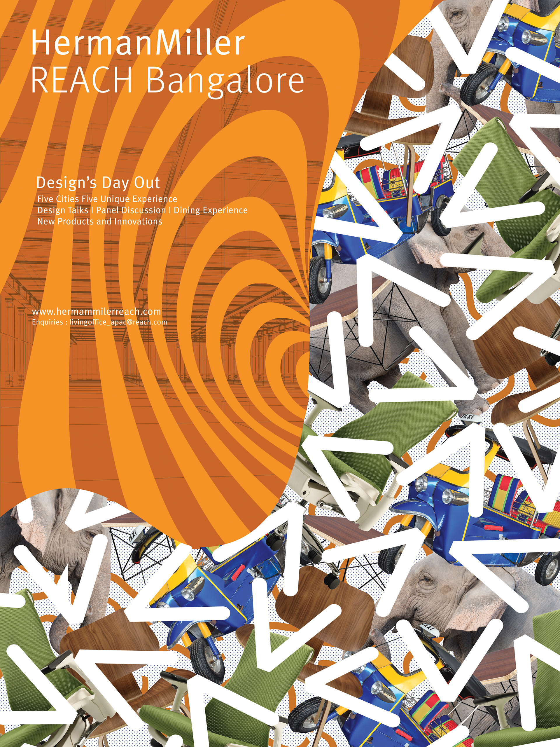
BANGALORE, INDIA
Influenced by the Tuk-Tuk, the elephant and spice colors


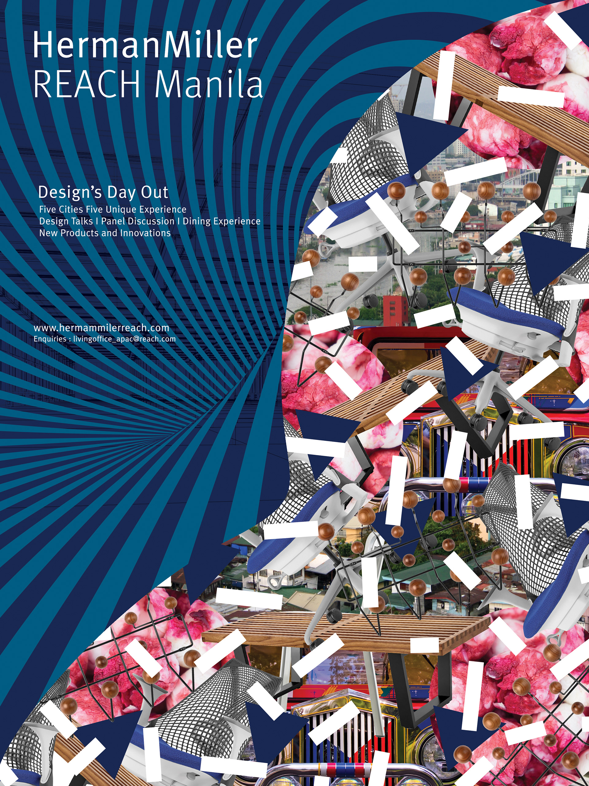
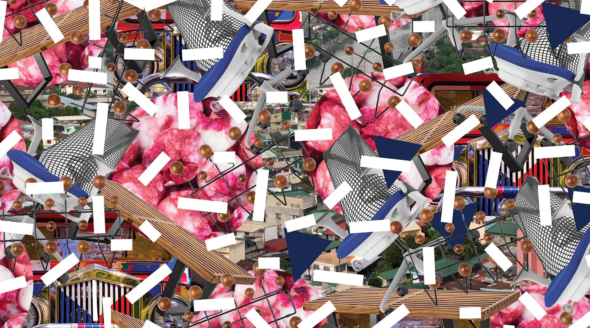
MANILA, PHILIPPINES
We went for the city landscape, their taxi and their famous Manila tamarind fruit
We went for the city landscape, their taxi and their famous Manila tamarind fruit


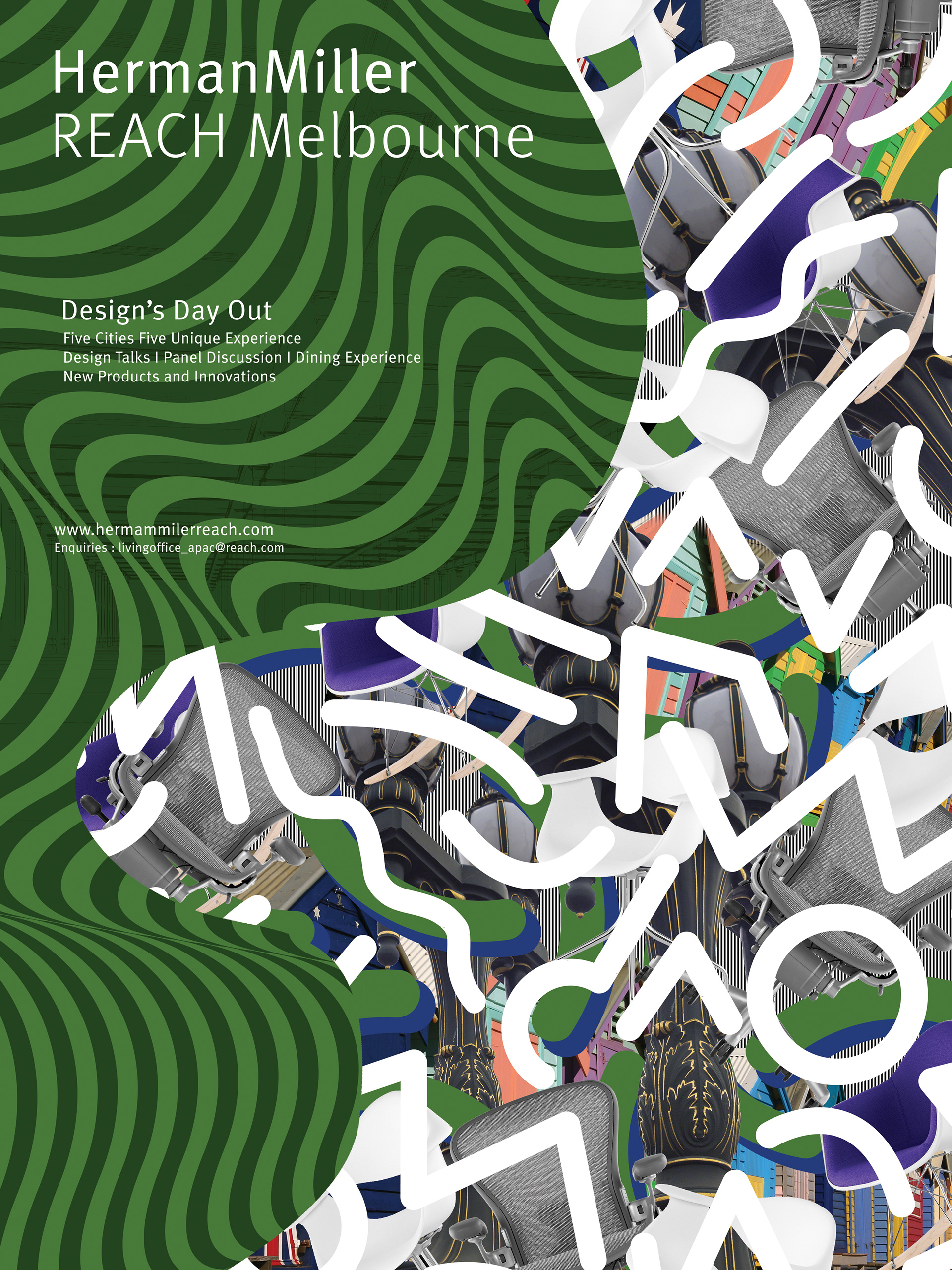
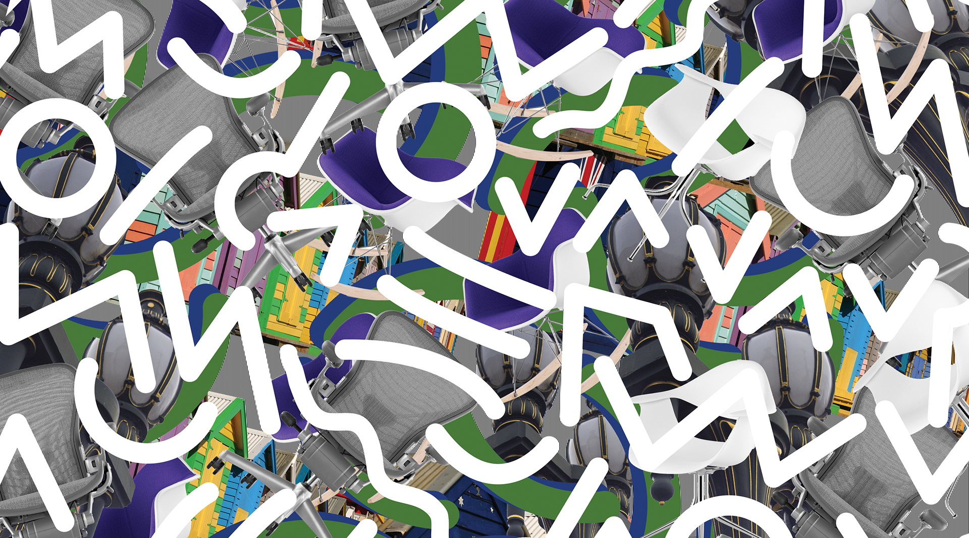
MELBOURNE, AUSTRALIA
We choosen the iconic colourful bathing huts and the amazing street lamps.


Previews made by Serafim Mendes